
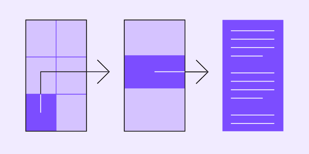
The navigation in an app serves as its backbone, and it must be seamless and intuitive. The importance of navigation in how users interact with and use your products cannot be overstated.
In a nutshell, navigation allows users to move around a website or app.
Navigation design is the process of creating, analysing, and implementing pathways for users to navigate through your website or app.
The goal of mobile navigation design is to get users to where they want to go with as little friction as possible. The designers can implement suitable tools to craft a whole navigation system in their mobile app, but app prototyping is one of the best tools.
This guide will cover navigation, navigation types, mobile navigation, best practises, and much more.
Let us first go over the definition of navigation in depth.
What Exactly Is Navigation?
The interaction that allows users to navigate into, across, and back from various content pieces within a website or application is referred to as navigation. By adhering to a set of principles, the navigation components ensure that users have a predictable and consistent experience.
Different Types of Navigation
The act of moving between the screens of an app to complete tasks is referred to as navigation. To enable it, one can use a variety of methods, such as incorporating navigation behaviour into content, dedicated navigation components, and platform accordances.
Navigational Directions
Because users can move in three directions, there are four different types of navigation; let’s take a look at them:
Lateral Navigation
Lateral navigation occurs when we move between screens on the same level of the hierarchy. It enables access to different app features and destinations, as well as pivoting between relevant items in a set.
The primary navigation component of an app should provide access to all destinations at the top level of the hierarchy. Apps that contain two or more top-level destinations can provide lateral navigation via a tab, bottom navigation bar, and navigation drawer.
Forward Navigation
When you move between screens at successive levels of a hierarchy, steps across an app, or in a flow. This type of navigation incorporates navigation behaviour into containers (such as lists, cards, or images), links, buttons, or by using search. One of the three types of movement between screens to complete a task is forward navigation:
- Directly from one screen in an app to another, such as from the home screen to a screen deep in the app’s hierarchy.
- Through an ordered sequence on a screen or a flow, such as a checkout process.
- To access deeper content in an app’s hierarchy, download from higher-level (a parent screen) to lower-level (a child screen).
You can use the following to implement forward navigation:
- Buttons that navigate you to a different screen.
- Internal links within the content
- Lists, cards, and image lists are examples of content containers.
- Search within the app on one or more screens.
Reverse Navigation
When a user navigates backward through screens within a single app, either hierarchically or chronologically.
Navigation in Reverse Chronology
Reverse chronological navigation occurs when you navigate in reverse order through your recently viewed screens’ history. It can transfer users between apps or between screens within an app.
The Back button, for example, is a type of reverse chronological navigation on a web browser.
Such navigation is provided by the operating system or platform, and the individual platforms explain how it works and how users can use it.
Upward Reverse Navigation
This type of navigation allows users to navigate one level up within an app’s hierarchy until they reach the app’s top-level or home screen.
The Up arrow, for example, is a type of upwards reverse navigation in a top app bar.
Furthermore, upward navigation for all app child screens must be implemented while adhering to platform guidance. The Material Up action is required for web and Android apps, while the back button within an iOS Navigation Bar is required for iOS apps.
What Exactly Is Mobile Navigation?
There are several ways to describe navigation in mobile apps.
Navigation refers to the path that users take to get from point A to point B. It will describe how users will discover and interact with your design.
Navigation, according to writers and designers, is like a road system that users follow to use the product.
Good mobile navigation will improve your product’s usability, allowing users to take advantage of all of its features.
Users will not be able to interact with your product as expected if the navigation is poor.
In this way, such a feature can make or break a mobile application. That is why navigation design is so important.
Mobile Navigation Best Practices
Now, let’s go over some of the best mobile navigation practises for making it simple for users to interact with and use your product quickly.
1. The navigation must be simple and intuitive
Of course, all types of navigation should be simple and easy to use. Because everything appears to be more noticeable on a mobile device due to increased interaction and reduced space, any mistake in the app’s navigation can have a greater impact on the experience than a web-based app. To make navigation appear intuitive to your target users, you must conduct extensive research and testing.
Your app’s navigation should be intuitive for your users. It should conform to user expectations and remove friction from navigation patterns.
2. Consider finger and hand positioning
This is critical for mobile apps because not every user’s finger is thin, but each should find it easy and comfortable to use. Nobody wants to waste time repeatedly tapping an icon and failing to get anywhere. It would be distracting and frustrating, potentially jeopardising the design team’s intended user experience.
So, to make it easier for users to tap successfully on the first try, include large enough buttons and links. A button with a diameter of at least 100mm is usually recommended.
Another thing to think about is the spacing between the elements that support app navigation.
3. The content must be readable
Mobile screens are obviously much smaller than those of any other device, such as a computer or laptop. This makes the app’s content difficult to read. Many apps, even those that rely on icons, use text-based navigation.
You can’t let your users struggle while reading anything, whether it’s the actual content or button or link text. Size is extremely important in mobile navigation. Take your time prototyping the navigation, testing it, and observing how users interact with it.
Consider a prototyping tool that allows realistic navigation simulation and can work with user testing platforms of your choice.
4. Avoid messes and think about visual hierarchy
Small screens easily lead to a shambles. As a result, your app design must avoid anything that is detrimental to the user experience. Minimalism is a type of user interface design. Even if you use fewer elements, users may find it difficult if a visual balance is not maintained.
The UI layout, content, and navigation must all work together to allow your users to interact with your app seamlessly. As a result, your content should follow a certain hierarchy, analysing the space between elements and leaving plenty of room for visual relief.
Eight User Interface Components for Navigation In Mobile Apps
Now, we will review some UI components for mobile navigation.
1. Hamburgers Menu
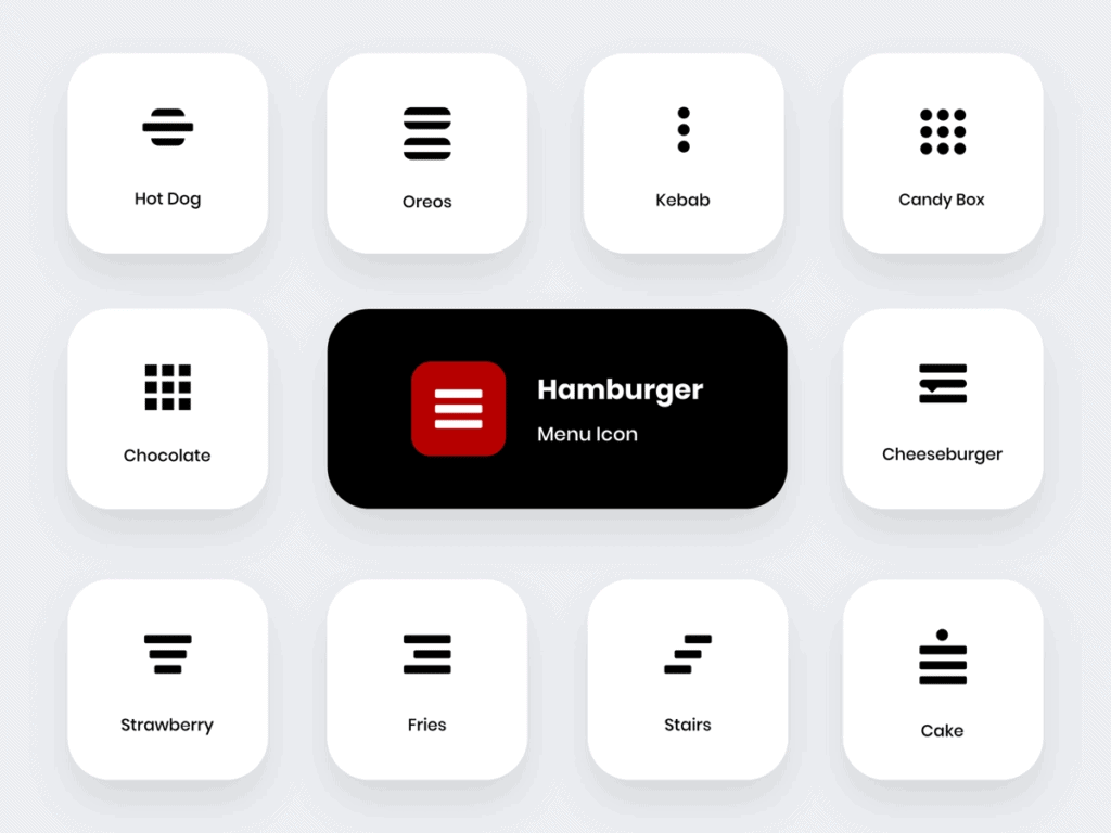
The hamburger menu is not well-known; some designers like to think about it, while others don’t.
Whatever your thoughts are, let me assure you that the three small horizontal lines in the app’s corner can be useful. It’s one of the most effective methods for hiding complex navigation so that users can enjoy more screen space.
According to some designers, the hamburger menu obscures navigation options, which may negatively impact user experience. It makes it difficult for users to find products at first glance. While some people find it simple to incorporate it into their app design by using a suitable colour scheme that ensures a contrast between the background and the icon.
The Hamburger menu’s best feature is that it can hold a large number of navigation options while freeing up screen space by shifting the options off the screen into a side menu. However, it reduces the discoverability of the options and may conflict with platform navigation rules, particularly in iOS. It may cause the navigation bar to become clogged.
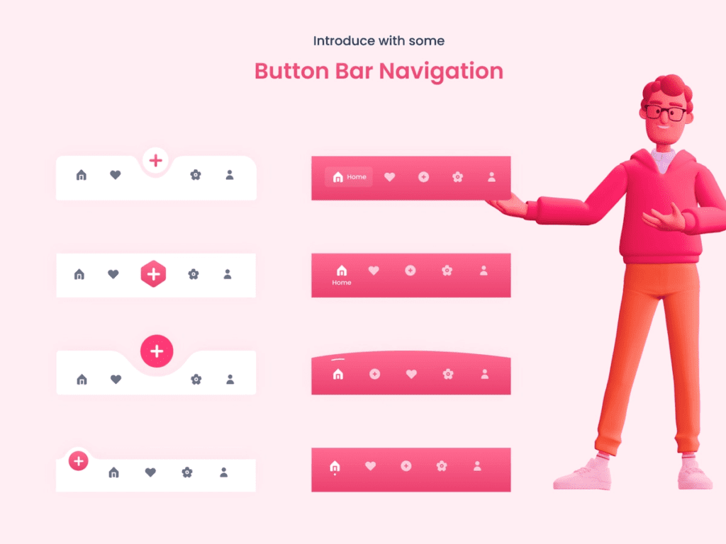
2. Bottom Navigation
Bottom navigation is a navigation bar that collects primary and secondary navigation links. This navigation is well-known for mobile apps because it allows users to navigate with their thumb while holding their device. It requires less strain and reduces the need to change the way a device is held, which improves the product’s usability.
Most bottom navigation bars include three to five quick-access destinations. Furthermore, with a single tap, you can navigate to specific design destinations with less effort.
3. Top Navigation
The top navigation is identical to the bottom navigation with the exception of location. The former is at the top of the screen. It, like the bottom navigation, makes it easier to use products while grasping mobile devices. The larger phones necessitate a change in mobile grasping position or the use of two hands to reach every link included.
Top navigation is typically used in conjunction with other modes of navigation.
4. Cards for Navigation
A fantastic design pattern, UI cards come in a variety of shapes and sizes and are the best way to display multiple elements, such as a link, text, or a photo, in one place. UI cards have become more personalised in recent years. They are widely regarded as an excellent method of assembling disparate pieces of information into a single location.
You can also customise the cards to display different types of content.
5. Tabs
When it comes to UI patterns, tabs aren’t all that different from navigation bars. A tab is a row that contains various options for accessing different screens while maintaining the same layout.
This pattern was inspired by desktop design. It typically includes a small number of destinations that are of similar importance and require direct access to anywhere in an app.
In a navigation bar, for example, there may be a home button, followed by a search function or a favourites button.
You can use tabs to switch between different views within the same context.
For example, if you have a stab system for an email platform, the first tab will show “primary” senders from your contact list, while the second will show other senders who are new to you.
The tab bar facilitates communication in the user’s current location. It allows users to see their current location at a glance. However, one disadvantage of the tab bar is that it can only hold a limited number of options. If you try to include more, the touch-target size will become difficult to maintain.
6. Gesture-Assisted Navigation
Users can use such navigation to quickly swipe in the direction they want to navigate through an app or perform a specific action. It has been used as a UI navigation pattern for over a decade, but it has gained popularity primarily among the top dating app users.
You can use it to swipe and tap or touch and drag horizontally and vertically, as well as zoom in and out. This way, you’ll be able to create a dynamic, interactive, and immersive experience.
The best part about this UI design pattern is that it is simple to use even for inexperienced users because the gestures are intuitive and only require a little experimentation to find the correct navigation.
This pattern works best when users need to easily and intuitively explore the information of specific content. Despite navigation menus, users will be able to spend more time with their content.
Such gestures make the user interface more natural, reducing UI clutter. But, at the same time, it makes navigation invisible and forces users to work harder to learn that specific gesture. As a result, you must teach people how to use the gesture so that they can easily interact with your app’s user interface.
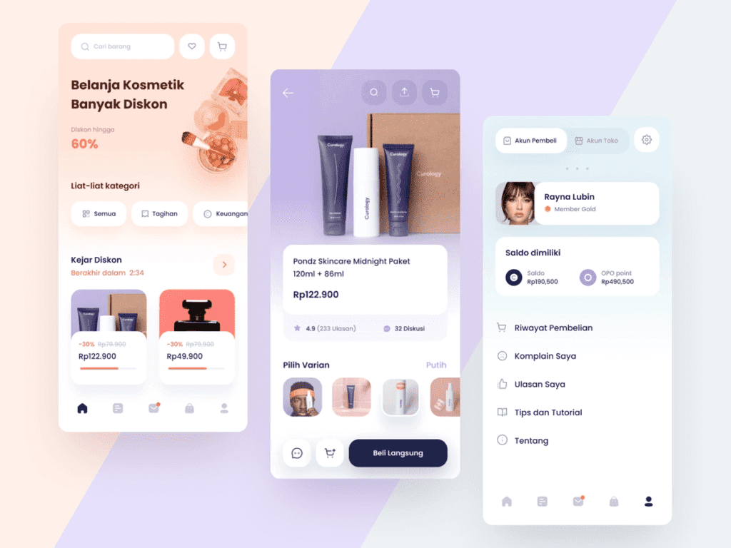
7. Full Screen Navigation
This navigation pattern makes better use of available space. It is sometimes referred to as a navigation hub because it takes users from a broad section of the product to very specific ones.
Various navigations can appear to be overwhelming at times. Some designers dedicate the entire screen to the app’s navigation, relying on visual hierarchy to keep users from becoming overwhelmed.
When you click on an image of a product, for example, in various shopping apps, it opens up that specific one using the entire screen space to provide a clear view of that product.
It’s the best way to provide a variety of navigation options that help users understand your product’s features quickly and easily.
Such patterns achieve simplicity, allowing you to organise large amounts of information in a systematic manner and display information clearly.
8. 3D Touch
The final method of mobile navigation is 3D touch. Apple was the first to publicise this practise of providing direct options from the iPhone’s home screen. This allows you to create a navigation shortcut that displays the key actions for the selected app.
This mobile navigation can be used to preview content. This may be a better way to provide a content preview to the user while dealing with multiple content options, such as a list of articles or an email inbox. Before even viewing the full content, you can perform relevant actions within an app.
In other words, applying a small amount of force to the mobile’s touch screen activates various functions. Users can use 3D touch to perform actions while they are away from the screens they are currently using.
You should keep in mind that 3D touch should not be the only way to access the main features. Mobile navigation must provide a clear path for users to catch up with primary features without accidentally discovering the 3D touch option.
This saves users a significant amount of time by eliminating the need for multiple taps within an app. Furthermore, this mobile navigation pattern makes interaction light and quick.
What Are Navigation Transitions?
When users move between screens, navigation transitions occur, such as when we move from a home screen to a detailed screen. It moves users from one screen to another within an app by using motion. They represent the app’s hierarchy by demonstrating how elements are related to one another.
When an element, for example, expands to fill the entire screen, this act of expression reveals that the second/new screen is a child element, while the old one, from which the new screen emerged, is its parent element.
1. Hierarchical Transitions
When users move one level up or down in an app, this is referred to as a hierarchical transaction. A parent and child link is maintained by screens on adjacent levels. The parent maintains a higher position in the hierarchy than its child.
Let’s get more specific!
On touch, an embedded child element appears from a parent screen and expands in that location via a container transform transition pattern.
2. Peers Transitions
It occurs between screens at the same hierarchical level.
Sibling transitions are also included in this category, as they occur between peers of the same parent. Top-level peer transitions aid in the transition between primary destinations.
The peer screen slides come from one side and slide in, while its sibling moves away from the screen in the opposite direction.
3. Flat Navigation
It’s flat navigation when we switch between content categories. Music and App Stores are the most common users of this type of navigation.
4. Experience-Driven or Content-Driven Navigation
Content-driven navigation occurs when you can freely move through content or when content defines navigation. It is used in books, games, and other immersive applications. Some apps combine different navigation styles.
For example, a flat navigation application may choose to implement hierarchical navigation within each category.
Conclusion
The user interface (UI) is a powerful tool for any mobile app to deliver an important and expected message to end users. So, by having an eye-catching and effective UI design, your customers will be confident that your products are the best and will assist them in completing their tasks.
It makes for a better mobile navigation design when you use a limited app space to meet users’ high usability expectations.
You must consider both returning and new users and make it easier for them to navigate your app. The more user-friendly your app is, the more likely it will be used.
I hope you found this post useful and helpful in developing a navigation system that will keep your users satisfied in terms of usability the entire time.